How to Wrap Controls onto the Next Row in a Horizontal Container in Power Apps

A horizontal container lines its controls up in a row. On a wide screen that's what you want; on a phone, the row is wider than the screen and the last controls are cut off or disappear. The container's Wrap property moves the controls that don't fit onto the next row, and one formula makes them full width on phones.
The example is the Home screen of the Overtime Timesheet app, where a horizontal container, conActionsHS, holds the app's action buttons: Log overtime, My overtime, Departments and, for some people, more.
Prerequisites
- A responsive canvas app: How to Make a Canvas App Responsive in Power Apps.
- A horizontal container with controls in it: How to Add a Horizontal Container in Power Apps.
The Problem: One Row, Too Narrow
The buttons are 200 pixels wide with a 16-pixel gap. On a phone, here the preview's Apple iPhone 12, 13, 14, three of them don't fit across. With Wrap off, My overtime is cut off at the edge, and Departments isn't visible at all:
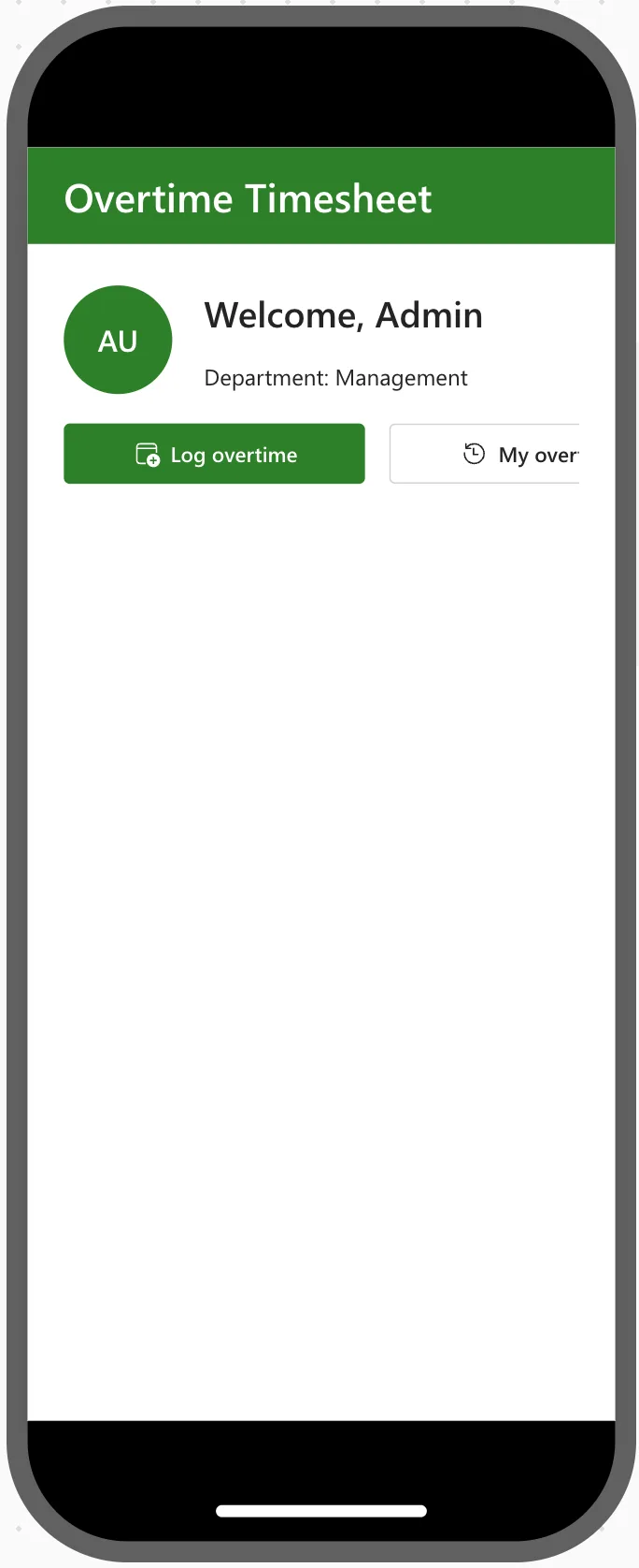
The container's Horizontal Overflow is Hide, so whatever runs past its edge is simply not shown. Scroll would add a scroll bar instead, which people on phones easily miss.
Step 1: Turn On Wrap
Select the container, here conActionsHS, and in the Properties pane's Display tab, under General, switch Wrap to On:
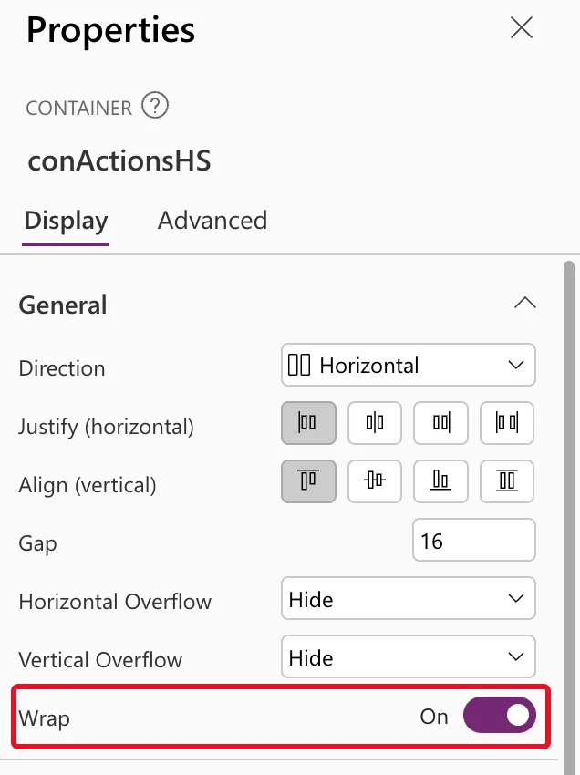
In formulas, the property is LayoutWrap:
true
Microsoft's Horizontal container reference describes Wrap as defining whether the content wraps to a new row or column when it cannot fit.
Step 2: Check It on a Phone
Preview the app at a phone size: How to Test a Power Apps Canvas App on Phone and Tablet Sizes. Each button that doesn't fit moves to a new row, and every button is visible:
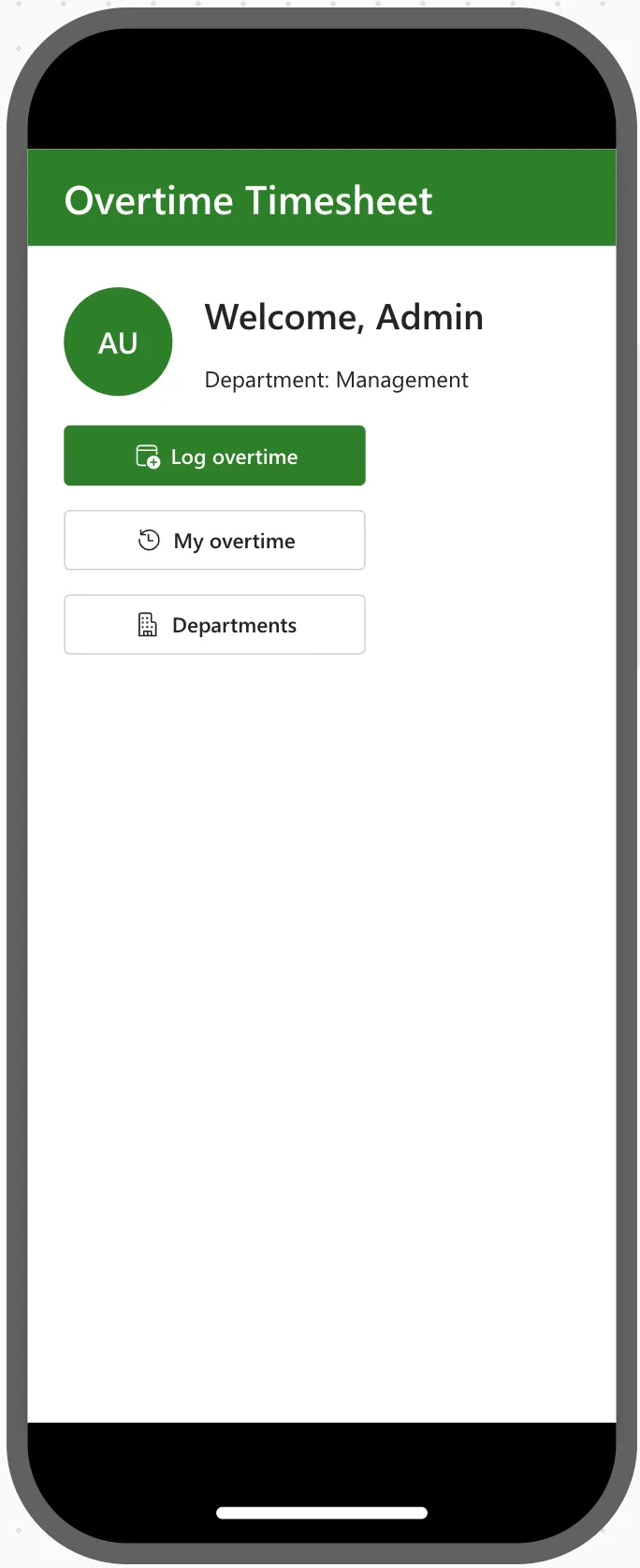
On a wide screen, nothing changes: the buttons still sit side by side, because they fit.
Step 3: Make the Controls Full Width on Phones
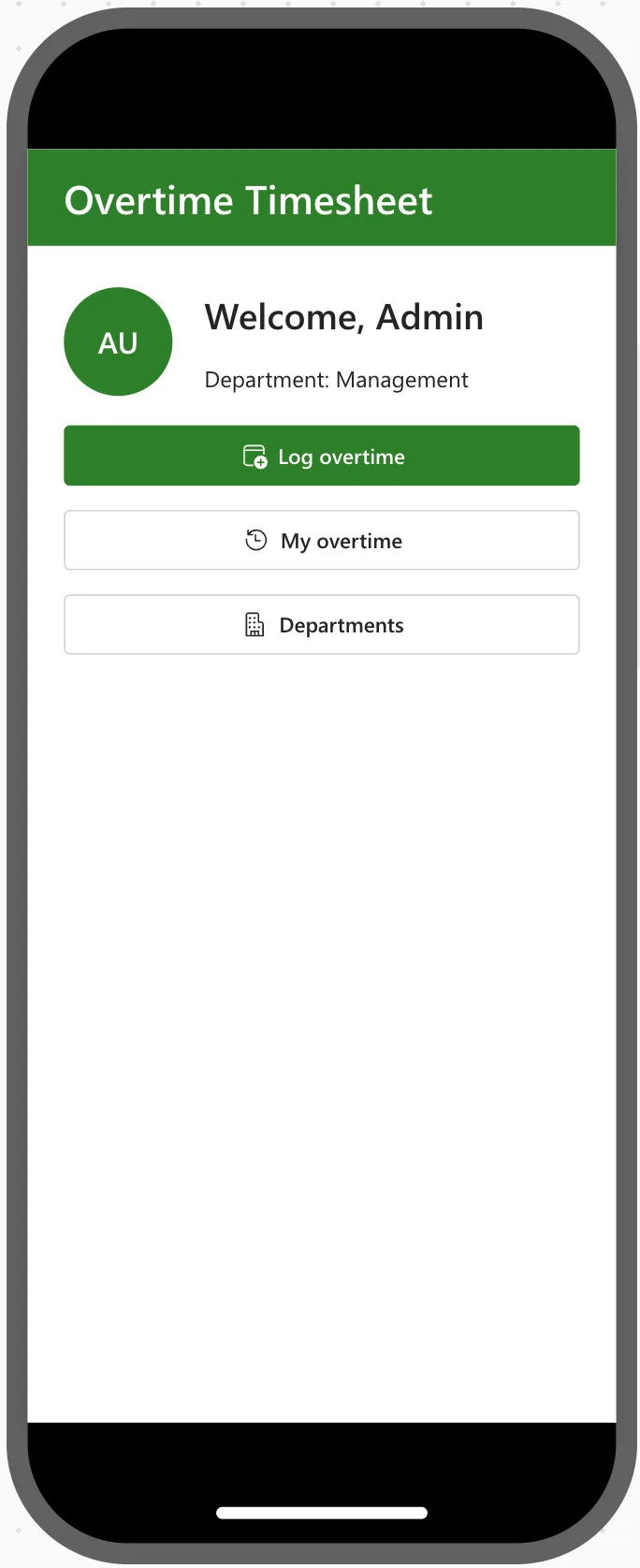
The buttons now stack, but at 200 pixels they leave an empty strip down the right. Set each button's Width to the container's width on small screens, and keep 200 elsewhere:
If(App.ActiveScreen.Size = ScreenSize.Small, Parent.Width, 200)
App.ActiveScreen.Sizeis the screen's size class, andScreenSize.Smallmeans a phone-sized window (How to Make a Canvas App Responsive in Power Apps explains the breakpoints).Parent.Widthis the width of the container the button sits in: How to Use Self and Parent in Power Apps.
Set it on one button, then copy the button for the others, so the formula comes along: How to Copy and Paste Controls Between Screens in Power Apps. On the phone, the buttons become one tidy column:
What Wrap Changes for the Container's Other Settings
- Align in container is ignored. Microsoft's known issues for responsive layouts say that when a container's Wrap is on, its child controls' Align setting is ignored. Align the rows with the container's own Align instead.
- The container needs room for the new rows. Rows go downwards, so give the container a flexible height, or set Vertical Overflow to Scroll if the rows might not fit. In the example the container fills the rest of the screen, which has room for every button.
Common Mistakes
| Mistake | What happens | Do this instead |
|---|---|---|
| Turning Wrap on in a container with a fixed, short height | The new rows are hidden below its edge | Give it a flexible height, or Vertical Overflow: Scroll |
| Setting Align in container on a button inside a wrapping container | The setting is ignored | Use the container's own Align |
| Fixed widths only | Wrapped buttons leave an empty strip on phones | Use Parent.Width on small screens |
| Using Horizontal Overflow: Scroll instead of Wrap | Controls hide behind a sideways scroll bar | Turn on Wrap |
Troubleshooting
| Symptom | Likely cause | Fix |
|---|---|---|
| Controls still run off the edge | Wrap is off, or the controls are in a different container | Select the container that holds them and check Wrap |
| A wrapped row is missing | The container's height is too small and Vertical Overflow is Hide | Let the container grow, or scroll |
| Buttons are full width on a tablet too | The Width formula doesn't test the screen's size | Use If(App.ActiveScreen.Size = ScreenSize.Small, Parent.Width, 200) |
FAQ
Does a vertical container wrap too?
Yes, the same property exists there. It moves controls that don't fit into a new column instead of a new row.
Can I control which controls go to the next row?
Not directly: controls wrap in the order they're in the container. Change the order in the Tree view to change what wraps first: How to Reorder Controls in a Container in Power Apps.
Conclusion
Turn on the container's Wrap (LayoutWrap = true) and controls that don't fit move onto a new row instead of running off the screen. Add If(App.ActiveScreen.Size = ScreenSize.Small, Parent.Width, 200) to their Width, and on phones they line up as one full-width column.
Additional Resources
- Horizontal container control in Power Apps: every property, including Wrap.
- Building responsive canvas apps: auto-layout containers and their known issues.
