How to Show Gallery Rows of Different Heights in Power Apps

In an ordinary gallery every row has the same height, so a line of text that wraps on a phone loses its end. A flexible height gallery lets each row grow with its content: turn on Auto height for the labels, place each one below the one above, and a two-line row is simply taller.
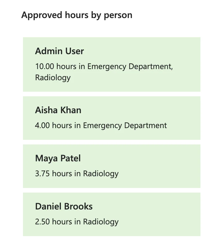
The example is the list of people on the Reports screen of the Overtime Timesheet app. Each card shows a person's name, then their approved hours and departments, such as 10.00 hours in Emergency Department, Radiology.
My first version used an ordinary blank vertical gallery with rows 76 pixels high. On a phone, that line wrapped, and Radiology was cut off. Splitting the line in two, as in Fixed: Text Is Cut Off Inside a Container on Small Screens in Power Apps, would only move the problem: someone who works in three departments would wrap again. Microsoft's guide Show items of different heights in a canvas app gallery is for exactly this.
How It Works
From Microsoft's guide:
- A Flexible height gallery shows each item at the height its content needs.
- Auto height on a label makes it grow or shrink to fit its content. The guide calls it the key to making the flexible height gallery work correctly: without it, all items render at the same fixed height.
- Each control's Y is set based on the Y and Height of the control immediately above it, so it moves down when the one above grows.
Step 1: Insert a Blank Flexible Height Gallery
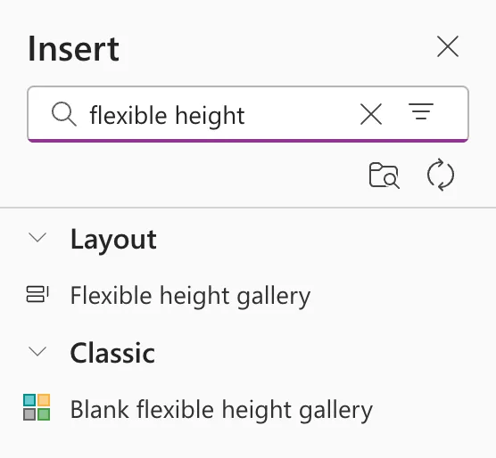
Open Insert and search for flexible height. Two results appear: Flexible height gallery under Layout, and Blank flexible height gallery under Classic. I used the blank one, which starts with an empty template, like the app's other galleries:
Set its Items and the rest of its properties as for any vertical gallery (How to Add a Vertical Gallery in Power Apps and Connect It to a SharePoint List). I set its TemplateSize to 76, the old rows' height.
Step 2: Put the Labels in the Template
Select the gallery's template with the pencil icon at its top-left, then insert or paste the labels there. Here, two Text controls: lblPersonRS for the name and lblPersonHoursRS for the hours and departments. A control pasted with the gallery itself selected goes beside the gallery, not into its template (Fixed: New Control Lands Outside the Gallery Instead of Inside It in Power Apps).
Give each label X 16 and Width Parent.TemplateWidth - 32. Inside a gallery, Parent is the template.
Step 3: Turn On Auto Height
Set AutoHeight to true on each label that can wrap:
true

Step 4: Place Each Label Below the One Above
The first label sits at Y 12. The second follows it, wherever it ends:
lblPersonRS.Y + lblPersonRS.Height + 6

If the name ever wraps, the hours line moves down with it.
Step 5: Leave Space Under the Last Label
On a phone, the first run of this gallery put each card's last line right against the card's bottom edge: a row ended where its lowest control ended. A bottom padding on the last label gives the row that space back, because Auto height counts the padding in the label's height:
16
The Result
On a phone 390 pixels wide, the first card's line wraps onto two lines and its row is taller; the others stay on one line:
Common Mistakes
| Mistake | What happens | Do this instead |
|---|---|---|
| Auto height on in an ordinary gallery | The label grows, but the row doesn't | A flexible height gallery |
| A fixed Y for the second label | A wrapped first label covers it | First.Y + First.Height + gap |
| No padding under the last label | The text touches the next row | PaddingBottom on the last label |
Troubleshooting
| Symptom | Likely cause | Fix |
|---|---|---|
| Every row is the same height | Auto height is off | Turn it on for the labels that wrap |
| Labels overlap in a tall row | The lower label's Y is a number | Chain it to the label above |
| A pasted label isn't in the rows | It went beside the gallery | Paste it into the template |
FAQ
When should I use an ordinary gallery instead?
When every row has the same content length, such as a name and a date. Microsoft's gallery reference notes one limitation of the flexible variant: if a user scrolls it before all items are loaded, the item in view can be pushed down when loading finishes.
Can images grow too?
The same way: set the image's Y from the control above it. Microsoft's guide places an image below a growing label like this.
Conclusion
For rows whose text can wrap, use a Blank flexible height gallery, turn on Auto height for the labels, chain each label's Y to the one above, and give the last label a bottom padding. Each row then grows with its content, on any screen.
