How to Make a Text Control Grow to Fit Its Text in Power Apps

A Text control has a fixed height, so text that needs more lines than it has room for is cut off. With Auto height on, the control grows to fit its text, and shrinks again when the text gets shorter.
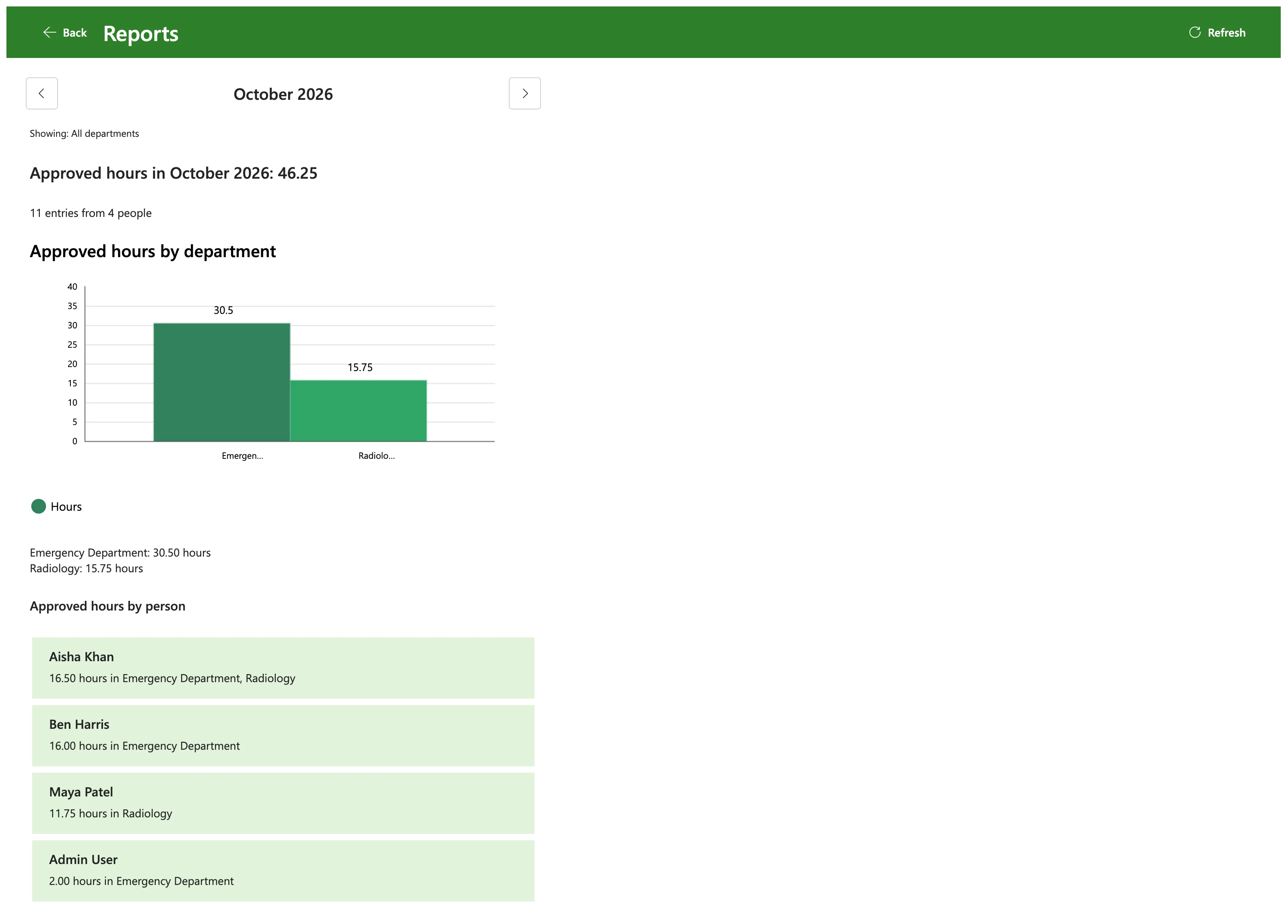
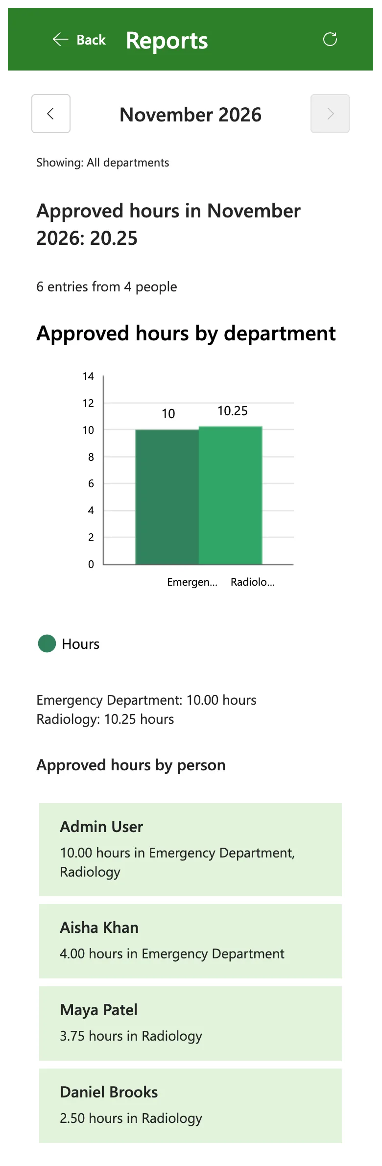
The example is the Reports screen of the Overtime Timesheet app. Under its chart, a Text control, lblDepartmentTotalsRS, lists each department's hours, one per line, and the number of lines depends on the month. In the list of people under it, each card's second line names the person's departments, and wraps onto another line on a phone.
Step 1: Turn On Auto Height
Select the Text control. In the Properties pane, on the Display tab, under Size and position, turn on Auto height:
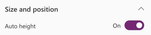
In the formula bar, it's the AutoHeight property, set to true:

Microsoft's Text control reference describes it as whether the control automatically increases its height when the text content exceeds the visible area.
Step 2: Keep Wrap On
Under Behavior, Wrap decides whether long lines continue on the next line. The reference says that with Wrap off, text is clipped at the control boundary. Leave it on for text that can be longer than the control is wide, such as the people's departments on a phone.
Step 3: Place What Comes Next
A control that grows needs room below it:
- In a vertical container, the controls under it move down as it grows (How to Add a Vertical Container in Power Apps). The Reports screen is built that way.
- In a gallery's template, set the next control's Y from this one,
lblPersonRS.Y + lblPersonRS.Height + 6, and use a flexible height gallery, so each card is as tall as its text (How to Show Gallery Rows of Different Heights in Power Apps).
Why Studio Can Show a Smaller Height
In Studio, the department totals' Size and position showed Height 32, with Auto height on:
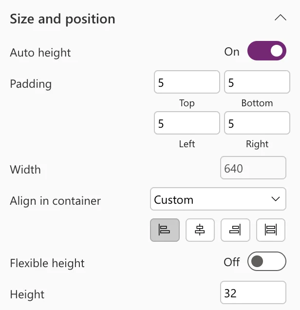
In Studio, the screen had no report loaded, so the control was hidden and had no text. The reference explains the rest: When Visible is false, the Height output property doesn't update as text changes. In the app, with a month loaded, the control showed both of its lines.
The Result
In the app, the department totals take the two lines they need, between the chart and the list of people:
On a phone, the first card's departments wrap onto a second line, and the card is taller than the others to fit them:
Common Mistakes
| Mistake | What happens | Do this instead |
|---|---|---|
| A fixed Height for text that varies | Extra lines are cut off | Auto height on |
| Wrap off | Long lines are clipped at the edge | Wrap on |
| A fixed Y under a growing control | The text runs under the next control | A vertical container, or Y from the control above |
| Judging the height in Studio | A hidden control doesn't update its Height | Check in Preview or in the app |
Troubleshooting
| Symptom | Likely cause | Fix |
|---|---|---|
| The text is still cut off | Auto height is off, or the container has a fixed height | Turn it on; let the container grow |
| Gallery rows overlap their text | The gallery's rows have a fixed height | A flexible height gallery |
| Height stays at its old value in Studio | The control is hidden | Look again when it's visible |
FAQ
Does the classic Label control have it too?
Yes: Microsoft's Label reference lists AutoHeight for it as well.
Does it shrink back?
Microsoft's gallery guide says that AutoHeight on a label causes it to grow or shrink to fit its content.
Conclusion
Turn on Auto height, keep Wrap on, and put the control where the things below it can move: in a vertical container, or with their Y worked out from it. A hidden control doesn't update its Height, so check the result in Preview or in the app.
Additional Resources
- Text modern control in canvas apps: AutoHeight, Wrap and the other properties
- Show items of different heights in a canvas app gallery
