How to Make a Canvas App Responsive in Power Apps

A new canvas app starts with App layout set to Fixed: Power Apps zooms the whole screen to fit the device, so a tablet-shaped app on a phone becomes a thin strip. Switch it to Responsive and each screen takes the size of the window instead. It's one setting, and it's the first step to an app that works on phones, tablets and desktops.
Microsoft's documentation calls the same choice Scale to fit: on means Fixed, off means Responsive. The example is the Overtime Timesheet app, a tablet-format app with one empty screen.
Prerequisites
- A canvas app open in Power Apps Studio. Microsoft recommends the Tablet format for apps that should respond to phone, tablet and web sizes: How to Create a Canvas App Inside a Solution in Power Apps.
Step 1: Open the Display Settings
Select App settings, the gear at the bottom of Studio's left-hand bar, then the Display tab. A new app shows App layout: Fixed, with the explanation "Your app layout is fixed. It will zoom in and out to fit the screen.":
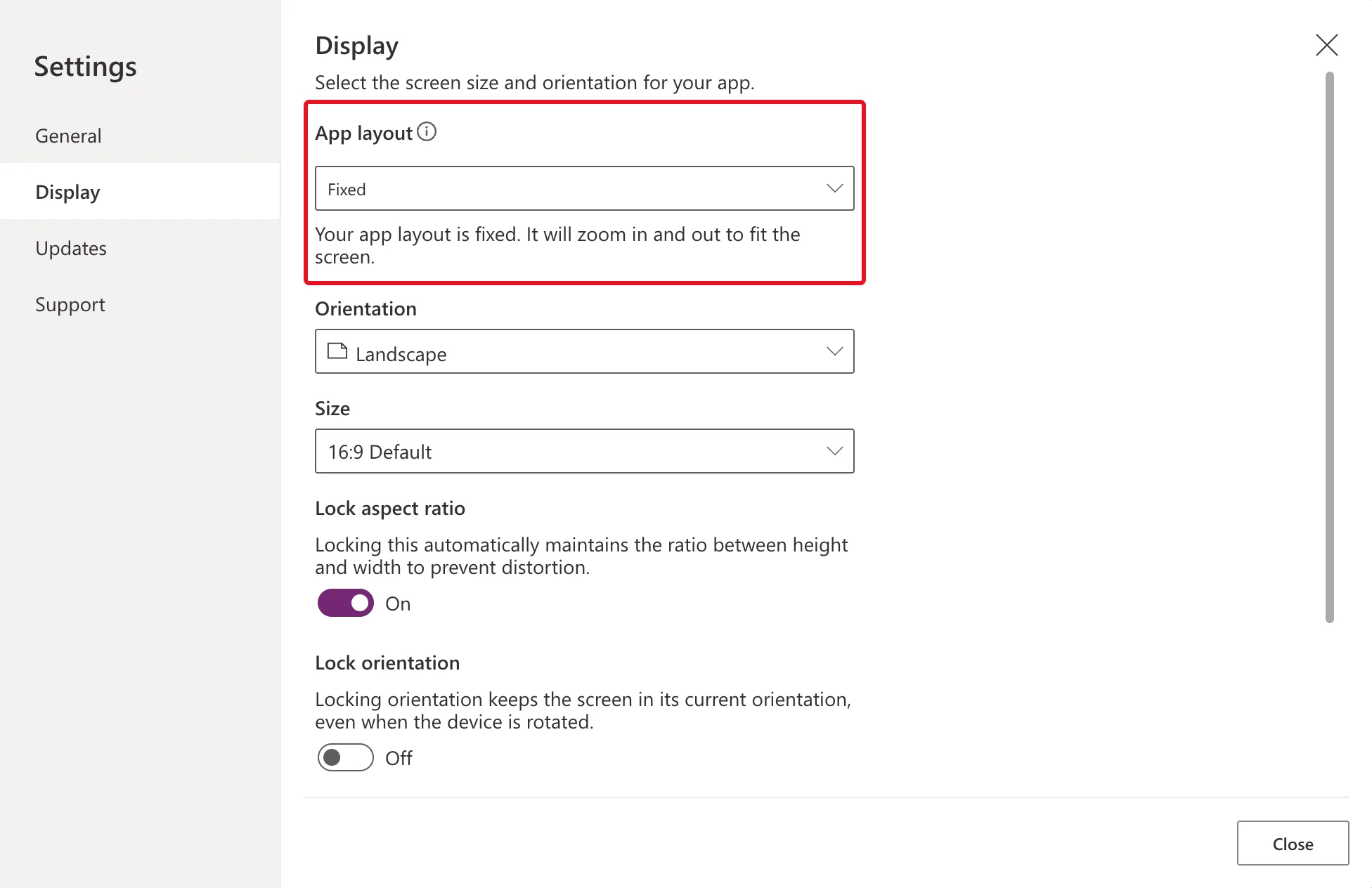
Orientation and Size describe the design canvas, here a 16:9 landscape tablet. Lock aspect ratio is on, which keeps that shape however big the window is.
Step 2: Choose Responsive
Open App layout and choose Responsive:
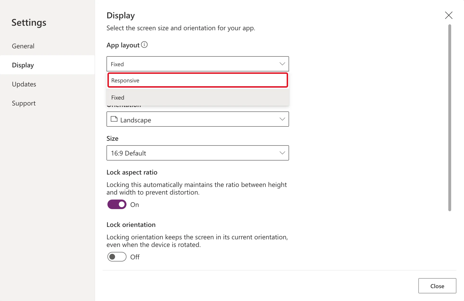
The explanation changes to "Your app layout is responsive. It will resize to match the screen." Orientation, Size, Lock aspect ratio and Lock orientation turn grey, and Lock aspect ratio switches itself off:
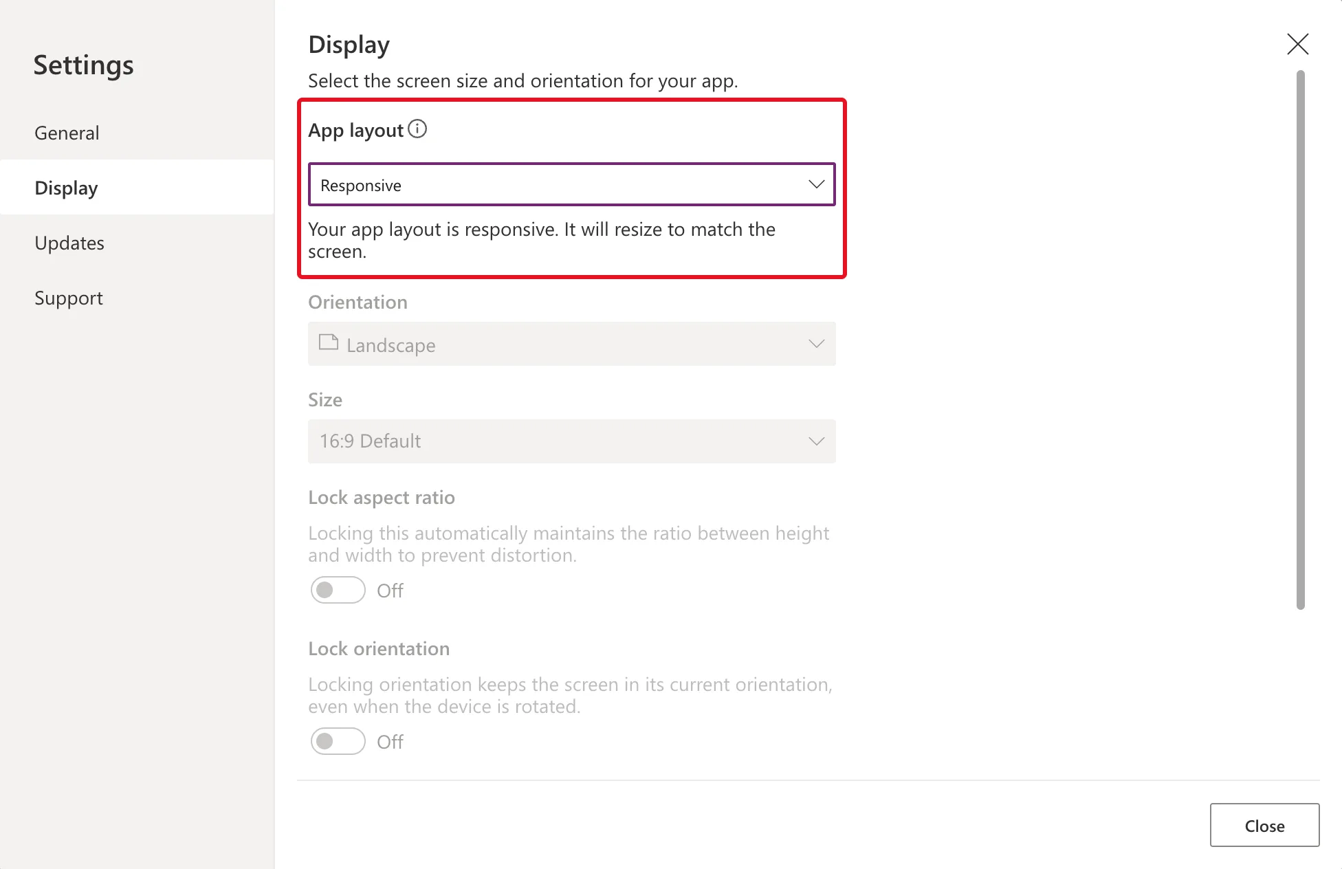
Close Settings and Save the app.
Step 3: See the Difference on a Phone
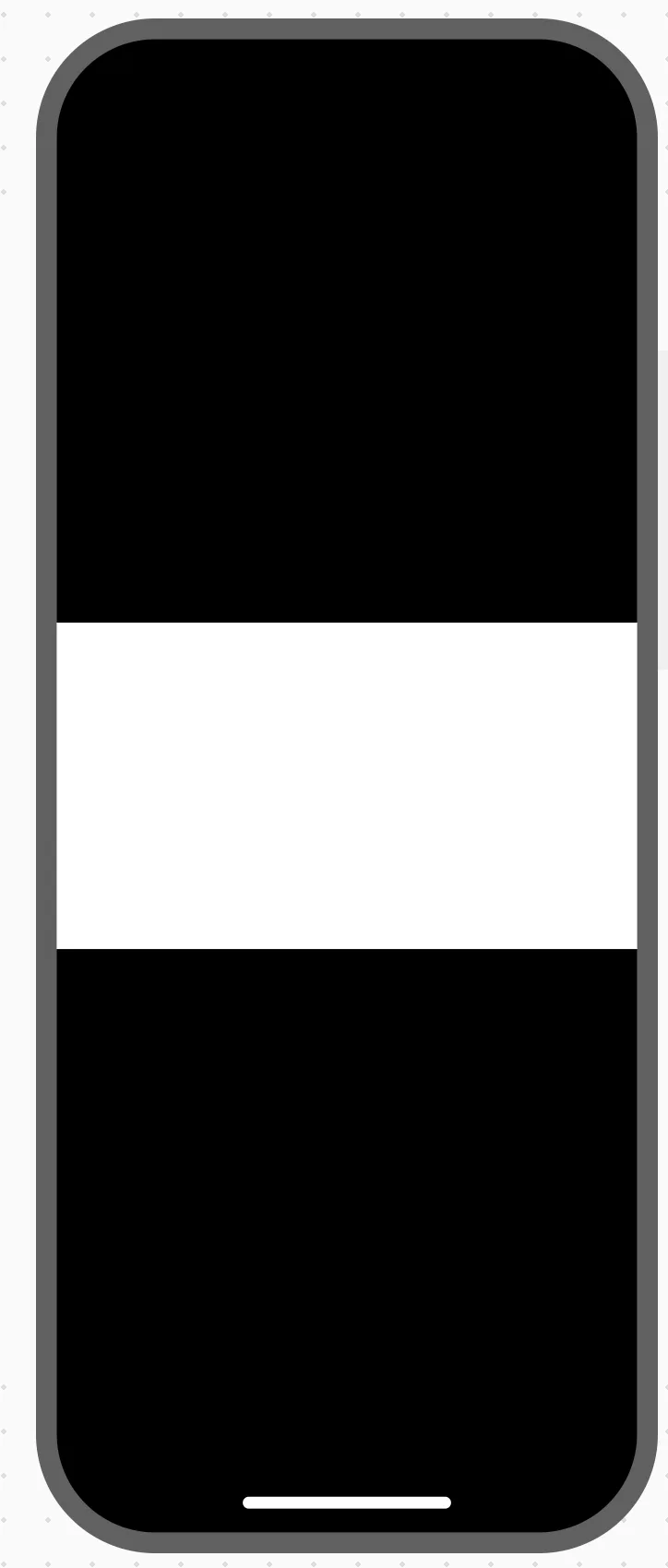
Preview the app and pick a phone from the preview's Phones list, here Apple iPhone 12, 13, 14 (390 × 844). With Fixed, the landscape tablet screen is shrunk to fit the phone's width, leaving a white strip between black bars:
With Responsive, the screen fills the phone:
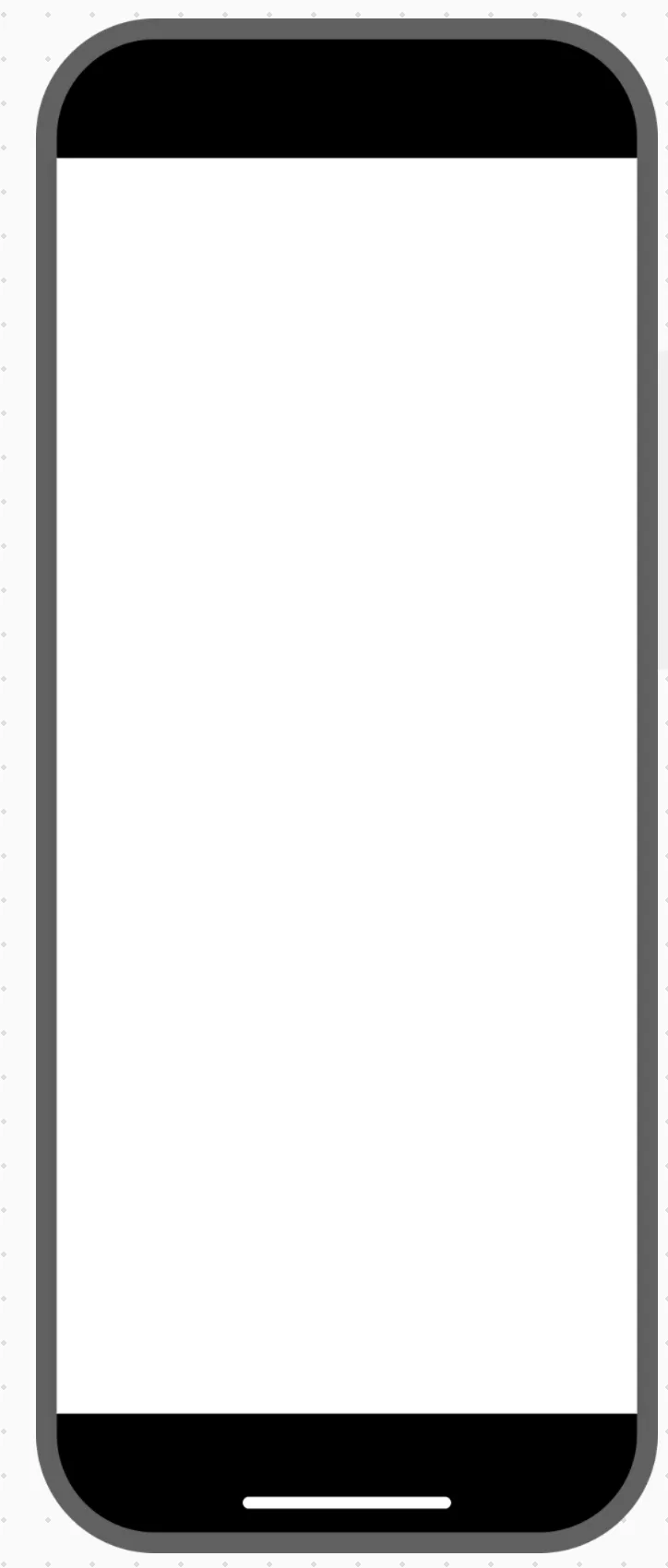
The screen is empty, so white is all there is to see. Everything you place on it later has to make use of the space, which is what containers are for: How to Add a Vertical Container in Power Apps and How to Add a Horizontal Container in Power Apps.
What Changes Underneath
Select the screen and look at its Width property. It's the same formula in both layouts:
Max(App.Width, App.MinScreenWidth)

Height is Max(App.Height, App.MinScreenHeight). What the setting changes is App.Width and App.Height. Microsoft's Change screen size and orientation says that with scale to fit on, the app's Width matches its design width; with it off, the app takes up all the available space. Max(…) keeps a screen from shrinking below App.MinScreenWidth and App.MinScreenHeight, which were 320 in the example. Below that, Microsoft's responsive layout article says, the user scrolls.
The App object also has SizeBreakpoints, [600, 900, 1200] here, Microsoft's default for tablet and web apps. A screen compares its width with them to set its Size, from ScreenSize.Small to ScreenSize.ExtraLarge, which formulas can use to adapt a layout.
Common Mistakes
| Mistake | What happens | Do this instead |
|---|---|---|
| Building screens before switching | Controls placed for a fixed 1366 × 768 canvas don't adapt | Switch first, then build with containers |
| Expecting controls to rearrange themselves | Only the screen resizes; controls keep their positions | Put them in containers, or size them with formulas |
| Creating the app in Phone format for every device | Microsoft recommends Tablet for apps that respond to every size | Use Tablet |
Troubleshooting
| Symptom | Likely cause | Fix |
|---|---|---|
| Orientation and Size are greyed out | App layout is Responsive; they only apply to Fixed | Nothing to fix |
| The preview doesn't match after resizing the browser | Microsoft's preview article lists this as a known issue | Close the preview and open it again |
| The canvas in Studio doesn't change size | Microsoft notes the authoring canvas doesn't follow sizing formulas | Test in the preview or the published app |
FAQ
Can I switch back to Fixed?
Yes, the same way. The example switched back for the comparison above and then to Responsive again. Screens built for responsive layouts may need rework for Fixed.
Do I need to change each screen's Width and Height?
Usually not. Microsoft's article says that once MinScreenWidth and MinScreenHeight suit your app, the default screen formulas rarely need changing.
Conclusion
Settings → Display → App layout → Responsive turns off scale to fit: screens follow the window instead of being zoomed. The screen formulas stay the same; App.Width and App.Height start following the real window. Next, build the screens with containers so their contents use the space.
Additional Resources
- Change screen size and orientation of canvas apps: scale to fit, lock aspect ratio and lock orientation.
- Create responsive layouts in canvas apps: screen formulas, minimum sizes and breakpoints.
- Building responsive canvas apps: auto-layout containers.
- Preview your canvas apps: device sizes and known issues.
