How to Design an Adaptive Card with the Adaptive Cards Designer

Writing an Adaptive Card's JSON by hand means guessing what it'll look like. The Adaptive Cards Designer shows you instead: drag elements onto a card, set their properties, and watch both the card and its JSON change as you go. When the card looks right, you copy the JSON into your project.
The Designer is a free web page from Microsoft, at https://adaptivecards.microsoft.com/designer.html. It's the designer Microsoft's Agents SDK documentation links to, and it needs no sign-in.
The Example
The card for this post invites people to join the book club: a title, a required field for their name, and a Join button that tells your agent which button it was. Every part of it is made with clicks.
Step 1: Open the Designer
Open https://adaptivecards.microsoft.com/designer.html in your browser. It starts with an empty card:
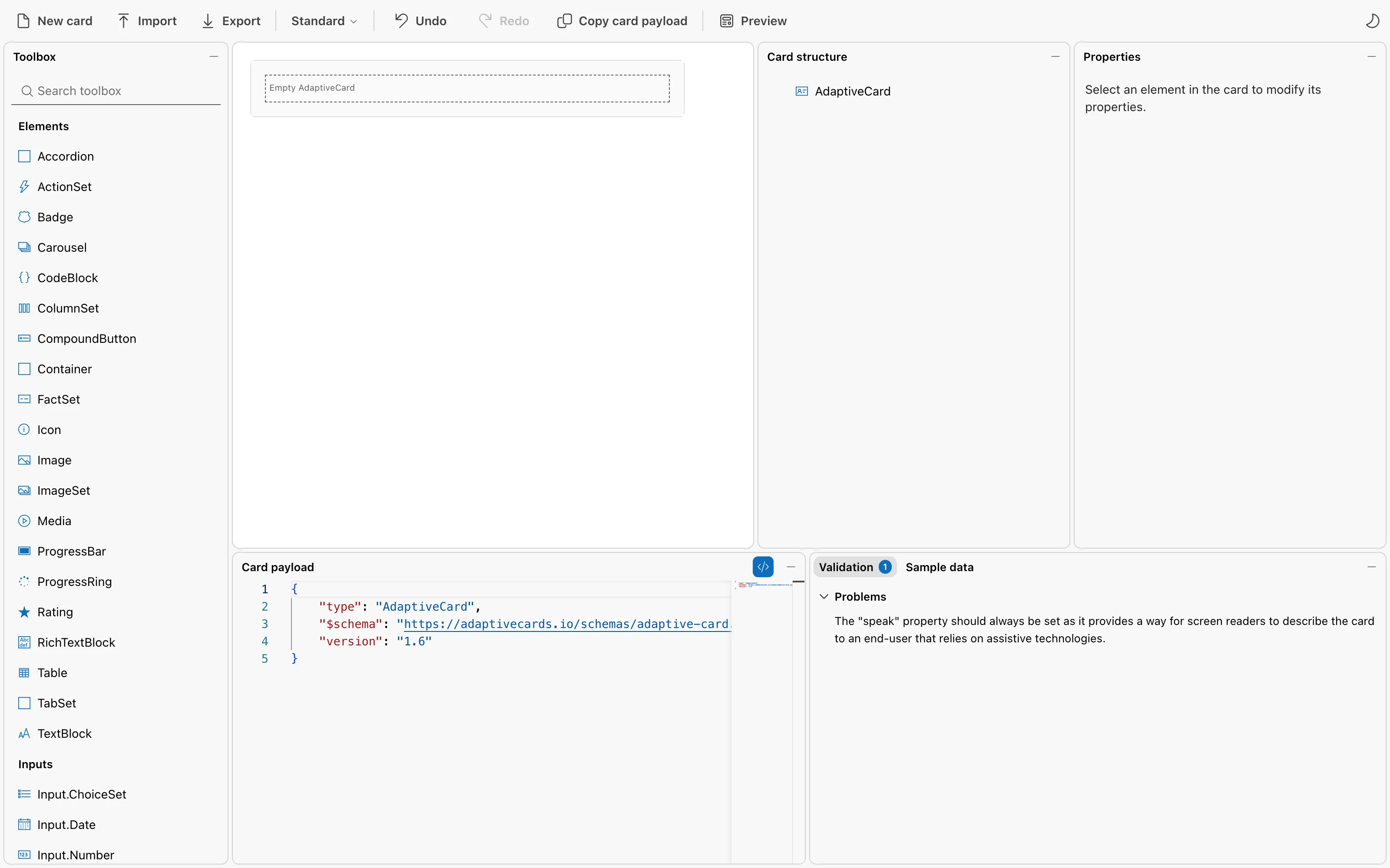
- Toolbox, on the left, lists everything a card can hold: elements that show things, inputs that collect them, and actions.
- The card, in the middle, is what you're building.
- Card structure shows the card's parts as a tree, and Properties shows the settings of the part you've selected.
- Card payload, at the bottom, is the card's JSON, which changes with every edit. Validation, next to it, lists problems the Designer finds.
Step 2: Add a Title
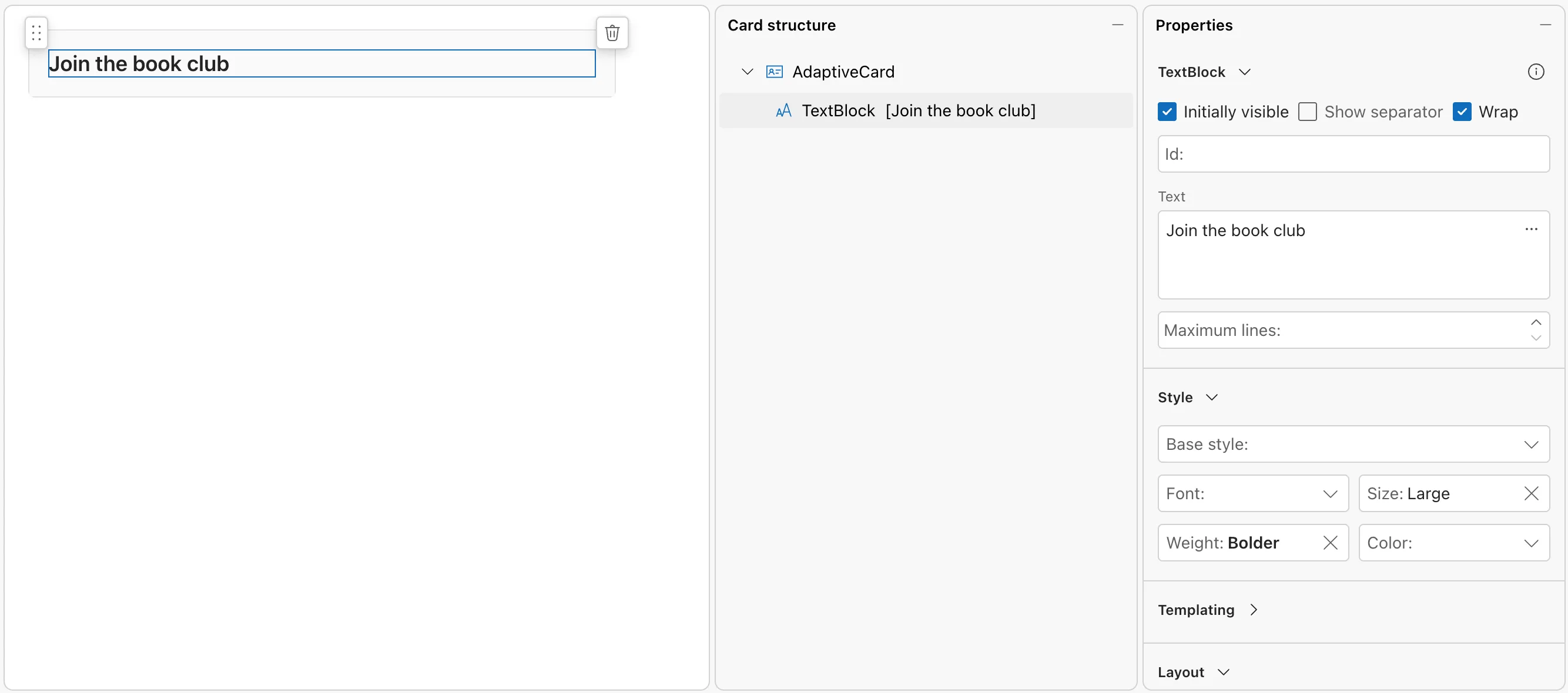
Drag TextBlock from the Toolbox onto the empty card. It appears with the text New TextBlock and is selected. In Properties:
- Replace the Text with
Join the book club. - Under Style, set Size to Large and Weight to Bolder.
Step 3: Add a Required Input
Drag Input.Text from the Inputs part of the Toolbox onto the card, just below the title. In Properties:
- Set Id to
name. The Id is the name the value will have when the card is sent back to your agent. - Set Label to
Your name, and Placeholder toFirst and last name. - Under Validation, tick Required, and set Error message to
Enter your name.
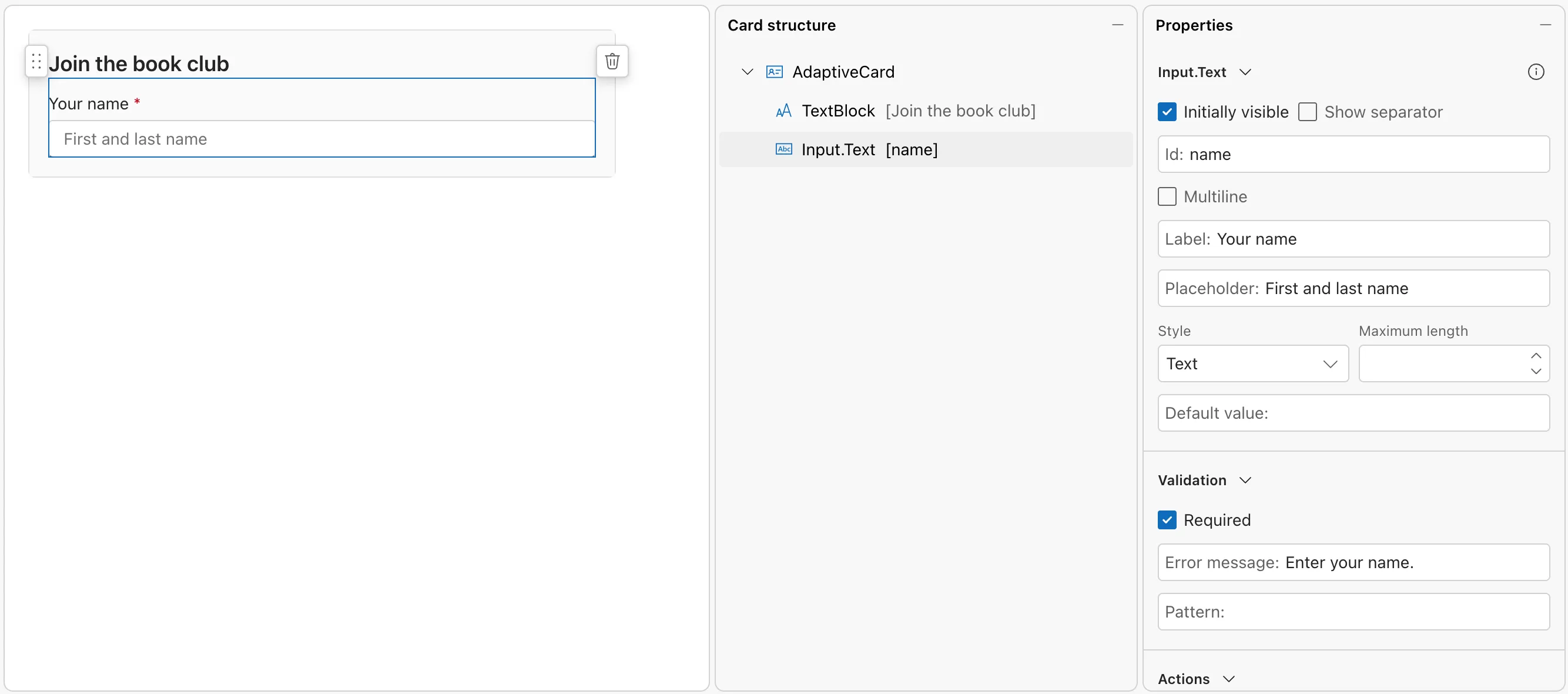
The label gets a red asterisk, the sign of a required input. Until the input has a value, the card won't be sent.
Step 4: Add a Button
Buttons belong to the card itself. In Card structure, select AdaptiveCard. An Add an action button appears under the card; select it:
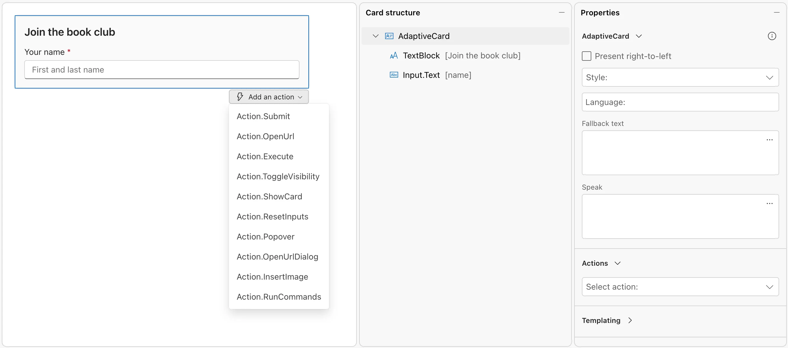
Choose Action.Submit. With the new button selected, in Properties:
- Set Title to
Join. - Set Data to
{"verb": "joinBookClub"}.
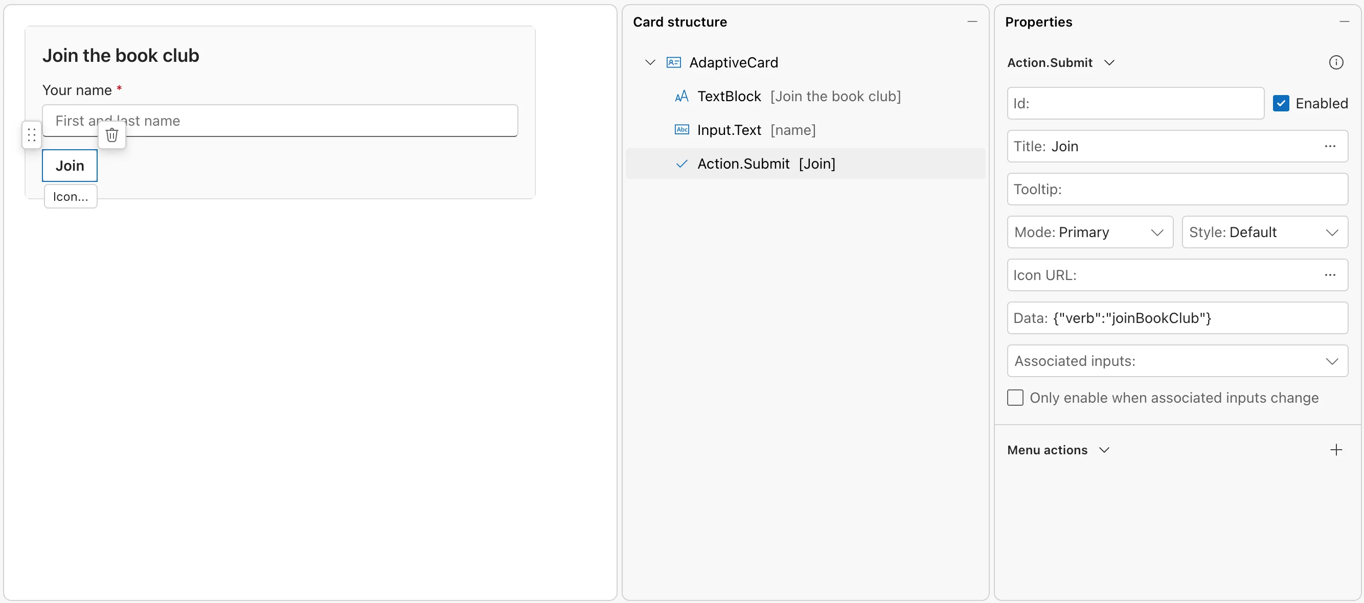
Data is what the button sends back along with the inputs. In the Microsoft 365 Agents SDK, AdaptiveCards.OnActionSubmit("joinBookClub", ...) routes the button by that verb.
Step 5: Describe the Card for Screen Readers
The Validation pane has been showing one message all along: The "speak" property should always be set as it provides a way for screen readers to describe the card to an end-user that relies on assistive technologies. Select AdaptiveCard in Card structure again, and set Speak to Join the book club. Enter your name, then select Join.
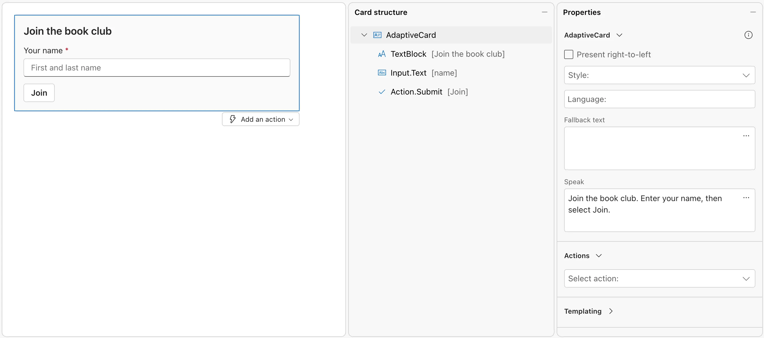
The top of the page now says No validation messages.
Step 6: Preview the Card at Every Width
Chat apps show cards at different widths, from a phone to a wide desktop window. Select Preview in the toolbar:
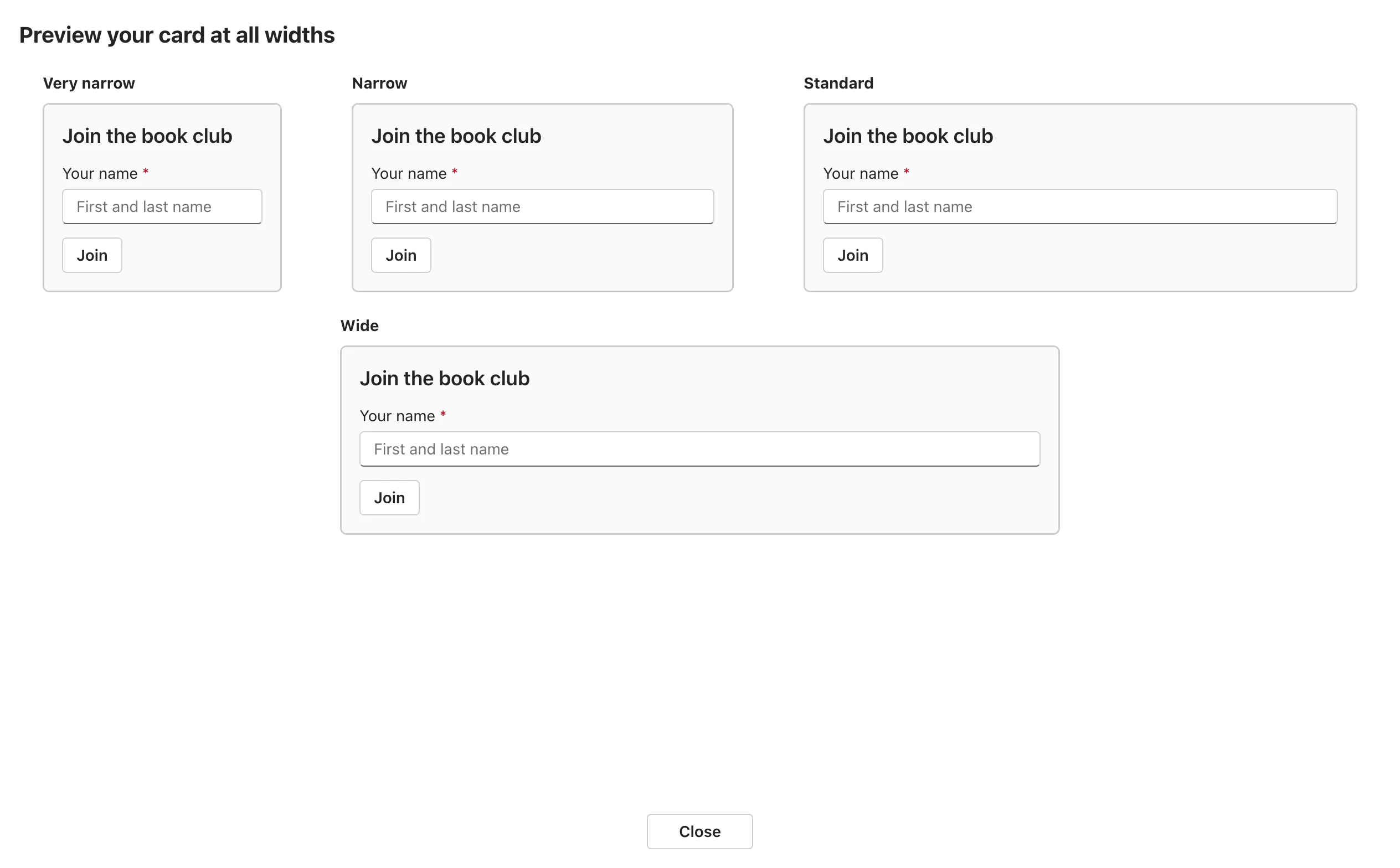
The card fits at every width here. Select Close to go back to the Designer.
Step 7: Copy the Card into Your Project
The toolbar has two ways to take the card with you:

- Copy card payload copies the card's JSON to the clipboard.
- Export downloads it as a file called
adaptive-card.json.
Save it in your project, for example as Cards/BookClubCard.json, and change the version to the one your host supports. The Designer writes every card as version 1.6, but Microsoft Teams and Microsoft 365 Copilot Chat support up to 1.5, so set it there, in your file. Changing it in the Designer doesn't stick: Fixed: The Adaptive Cards Designer saves the card as version 1.6 shows what happens. The finished card:
{
    "type": "AdaptiveCard",
    "$schema": "https://adaptivecards.io/schemas/adaptive-card.json",
    "version": "1.5",
    "body": [
        {
            "type": "TextBlock",
            "text": "Join the book club",
            "wrap": true,
            "size": "Large",
            "weight": "Bolder"
        },
        {
            "type": "Input.Text",
            "label": "Your name",
            "placeholder": "First and last name",
            "id": "name",
            "isRequired": true,
            "errorMessage": "Enter your name."
        }
    ],
    "actions": [
        {
            "type": "Action.Submit",
            "title": "Join",
            "data": {
                "verb": "joinBookClub"
            }
        }
    ],
    "speak": "Join the book club. Enter your name, then select Join."
}
The Designer added "wrap": true to the title by itself, so long titles wrap instead of being cut off.
Common Mistakes
| Mistake | What happens | Do this instead |
|---|---|---|
| Leaving an input's Id empty | Its value can't come back to your agent, and Validation reports that inputs need a unique Id | Give every input an Id |
| Leaving the version at 1.6 for Teams or Copilot | Hosts that support a lower version show the card's fallbackText instead of the card | Set 1.5 in your file |
| Using an element newer than your host's version | The host may not show it | Check each element's version in the schema explorer |
| A button without Data | Your agent can't tell which button was selected | Give each button data with a verb |
Troubleshooting
| Symptom | Likely cause | Fix |
|---|---|---|
| Unknown property "verb" in Validation, after you typed in the Card payload pane | The Designer flags properties inside a button's data, which can hold anything | Leave it; the card is valid |
| The copied card says version 1.6 | The Designer always writes 1.6 | Set the version in your file |
| An element lands in the wrong place | It was dropped above or inside another element | Drag it again, or select it and use the delete button that appears next to it |
FAQ
Do I need an account to use the Designer?
No. The Designer runs in the browser without signing in.
What do the width options in the toolbar do?
Very narrow, Narrow, Standard and Wide change the width of the card you're editing, so you can see it the way a phone or a wide window will show it. Preview shows all four at once.
Can I start from an example?
Yes. New card offers a list of sample cards to start from, as well as an empty card.
Conclusion
The Adaptive Cards Designer turns card design into dragging and setting properties, with the JSON written for you. Build the card, check it in Preview, copy it into your project, and set the version your host supports there. Your agent then sends the file as it is.
Additional Resources
- Tools and samples: Card Designer — the Designer and the other Adaptive Card tools.
- Adaptive Cards for agent design — design guidance and the version each host supports.
- Use adaptive cards in agents — sending a designed card from an Agents SDK agent.
