Fixed: Scroll Bar Appears Inside a Text Control in Power Apps

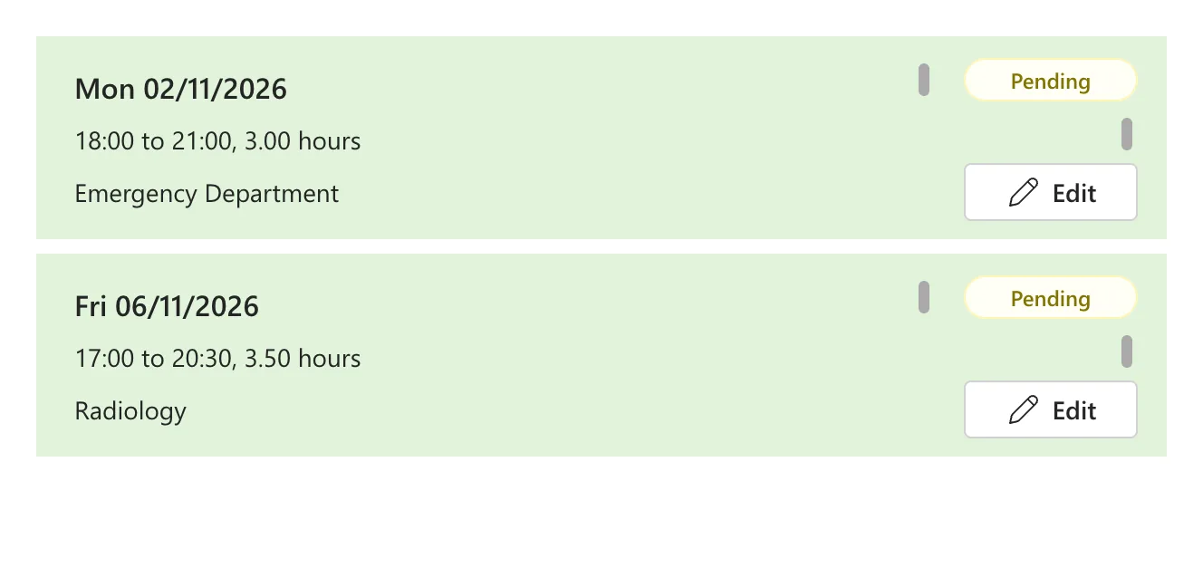
Every row of a Power Apps gallery showed a thin grey scroll bar at the end of its first two lines of text. The two Text controls were 24 pixels high and kept their default padding of 5 at the top and bottom, which left less room than one line of text needs. Setting PaddingTop and PaddingBottom to 0 removed the scroll bars.
What I Was Doing
I was building the rows of a gallery on the My Overtime screen of the Overtime Timesheet app. Each row shows an overtime entry in three lines of text, with a status badge and an Edit button on the right (How to Add a Text Control in Power Apps). I inserted three Text controls into the gallery's template and set their position and size:
| Text control | Shows | Height | Size |
|---|---|---|---|
lblEntryDayMO | The day, such as Mon 02/11/2026 | 24 | 16, Semibold |
lblEntryTimesMO | The times and hours, such as 18:00 to 21:00, 3.00 hours | 24 | 14 |
lblEntryDepartmentMO | The department | 32 | 14 |
I didn't change any of their other properties.
What I Expected
One line of text in each control, the way the labels on the app's Log Overtime screen look.
What I Got
With the canvas at 100%, every row had a short grey scroll bar at the right end of the day and at the right end of the times. The department line had none:
What I Checked
The controls' properties. I read each one in the formula bar:
| Property | lblEntryDayMO | lblEntryTimesMO | lblEntryDepartmentMO |
|---|---|---|---|
| Height | 24 | 24 | 32 |
| Size | 16 | 14 | 14 |
| PaddingTop | 5 | 5 | 5 |
| PaddingBottom | 5 | 5 | 5 |
| AutoHeight | false | false | false |
All three had the same padding, which I hadn't set: the controls had it from the start. Only the two 24-pixel controls had scroll bars.
Microsoft's reference for the control. The Text modern control page describes the properties involved:
- PaddingTop: Distance between the text and the top edge of the control. PaddingBottom is the same for the bottom edge.
- Size: The font size of the text, in points.
- AutoHeight: Whether the control automatically increases its height when the text content exceeds the visible area.
The page doesn't mention a scroll bar, but it does describe text that exceeds the visible area when the control doesn't grow.
Why It Happens
The text has to fit between the two paddings. In a 24-pixel control with 5 at the top and 5 at the bottom, that's 14 pixels. Font sizes are in points, and a point is 1⅓ pixels, so a 14-point line is about 19 pixels high and a 16-point line about 21: more than the 14 pixels available. The text didn't fit, and the control showed a scroll bar.
The department control is 32 pixels high, which leaves 22 pixels between its paddings: enough for a 14-point line, so it had no scroll bar.
The Fix
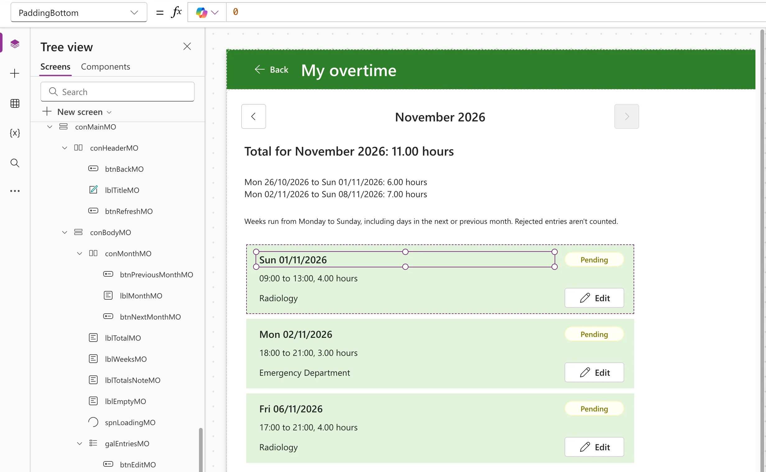
Set PaddingTop and PaddingBottom to 0 on each control that's only one line high. The text then has the control's full height. I did it on all three, so the lines start at the same place:
0
Other ways
- A taller control. With the padding left at 5, a height of 32 had room for a 14-point line, as the department showed. The row needs more height for the same three lines.
- AutoHeight. It grows the control to fit its text, but a gallery's rows don't grow with it: each row is TemplateSize high, so the text can still be cut off at the bottom of the row (Fixed: Text Is Cut Off Inside a Container on Small Screens in Power Apps).
After the Fix
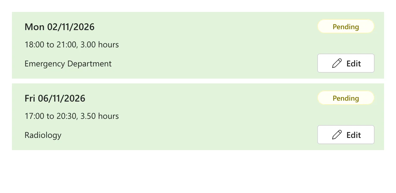
The same rows, with no scroll bars, and the three lines evenly spaced:
Common Mistakes
| Mistake | What happens | Do this instead |
|---|---|---|
| Leaving the default padding on a short Text control | A scroll bar at the end of the text | Padding 0 for one-line controls |
| Fixing it with AutoHeight in a gallery | The control grows, but the row doesn't | Padding 0, or a taller TemplateSize and control |
| Checking only at Fit to window zoom | The scroll bars are small and easy to miss | Zoom to 100% and look at a row |
Troubleshooting
| Symptom | Likely cause | Fix |
|---|---|---|
| A grey bar at the right end of one line of text | The text is taller than the space between the paddings | Padding 0, or more height |
| A taller control in the same row has no bar | It has room for its text inside its padding | Nothing to fix there; check the shorter ones |
The bar is still there with padding 0 | The text wraps onto a second line: Wrap is true by default | Make the control wider, or shorten the text |
FAQ
Do I need padding 0 on every Text control?
No. Controls with AutoHeight on, or with room for their text, are fine. It matters for one-line controls with a fixed height of about two dozen pixels, which is common in gallery rows and forms.
Why did the Log Overtime screen's labels have no scroll bars?
Its labels were set to Height 20 with padding 0 at the top and bottom when they were added: Build an Overtime Timesheet App in Power Apps — Part 6.
Conclusion
A Text control needs its height to cover the text plus PaddingTop and PaddingBottom. The modern Text control starts with 5 at each; at 24 pixels high, that left less room than one line, and the control showed a scroll bar. Padding of 0 gives the text the full height.
Additional Resources
- Text modern control: PaddingTop, PaddingBottom, Size and AutoHeight.
